This is the February 2020 update (with a few additional days’ data and up to 6th March 2020) for the State of Indian Stock Markets. This update includes the historical analysis (since 1999, i.e. about 20+ years) and Heat Maps for the key ratios like P/E, P/BV ratios and Dividend Yield for Nifty50 and Nifty500.
Since many people take the heatmaps on their face values alone, I want to highlight a few important things before we move forward:
- National Stock Exchange (NSE) publishes index level PE ratios based on standalone numbers and not the consolidated numbers. Does it matter? To an extent yes. It would be ideal to use consolidated numbers as many Nifty companies now have subsidiaries that have a significant impact on the overall earning numbers of these companies. And this has a much larger impact now than it had in previous years as many subsidiaries are now much larger than ever. And more importantly, this will matter more and more going forward. But NSE (as of now) continues to publish Nifty PE using its own set of criteria and decisions and for now, sticks with the standalone figures.
- So for now, we continue to use the officially published figures: which is index PE based on Standalone numbers. How different will the PE based on Consolidated figures be? It has to be arrived at using calculations as NSE doesn’t publish it. But by some estimates, it should be around 10-20% lower than the standalone PE. So if (let’s say) the standalone PE is 25, then the consolidated PE would be between 20-22.5. Or it’s more likely to be somewhere in between that range for now.
- So if consolidated PE is a better representative, then is the ratio analysis based on the standalone data still relevant? Yes, it still is. The trends still rhyme if not exactly. But as long as you know at the back of your mind that these are standalone figures and that the consolidated figures (PE ratio, etc.) are lower, you will know how to comprehend the data.
- At times, some sectors in index get far more weight than is prudent to give from diversification and concentration risk perspective. And its also possible that at the very same time, their earnings may be unexpectedly high or low. If and when this happens, the index level earnings will be impacted accordingly due to higher-than-necessary sector weight – which in turn may skew the PE data at that point of time.
- Similar to the point discussed above, it is also possible that at times, some (or few) individual index constituents might have high earning or market cap at an individual level(s) which might, to some extent, skew the PE data at the index level as well. The possibility of this happening is rare to low but still non-zero as the period under consideration in our analysis is long term here.
- The numbers shown in the analysis/tables in later sections are the averages of P/E, P/BV and Dividend Yield in each month (unless otherwise stated). Neither Nifty50 heat maps nor Nifty500 heat maps show the maximum or the minimum values for each month. So depending on how much the indices fluctuate within a month, the PE and other ratios will fluctuate accordingly too.
- Never make any investment decision based on just one or two ‘average’ indicators (here’s Why?) At most, treat these heat maps as broad indicators of market sentiments and a reference of market’s historical mood swings.
- I would want to additionally clarify something here (as I get a lot of queries for this). That the PE ratio is just one of the many factors in the overall, much broader model that I use to track markets, sentiments and comprehend equity things in general. I do not publish the full model publically as its kind of proprietary (I hope you understand). So don’t think that just because one indicator says markets are good to buy (or crash) then you should blindly go ahead and buy (or sell).
Sorry for so many points before coming to the actual data. But it was necessary so that people understand the assumptions, the actual basis of this analysis and how to use it in their investment decisions.
So without further ado, here are the Nifty 50 Heat Maps…
Historical P/E Ratios – Nifty 50 (Monthly Average)

P/E Ratio of Nifty50 (on 6th March 2020): 25.01
As I said earlier, the above PE data is based on standalone figures. So if we were to estimate the PE based on consolidated data, then using 10-20% adjustment, it would be around 20-22.5. And if you are familiar with my PE Vs Return Analysis of 20+ years, you will agree that it is still not cheap from the historical standards. But it is also not as expensive as it would seem if you were to look just at the standalone PE figures (~ 25-26).
But what about the recent past?
What if we looked at the movement of Nifty’s PE in the last 12 months? Here is a graph depicting the same:

Now, let’s have a more detailed look at how the last 12 months have panned out when it comes to Nifty movements and its implications (alongwith earnings’) on PE ratio of the index.
I suggest you spend some time on the table below (which shows month-wise data cuts) to gauge its importance in highlighting the trends in the last 1 year:

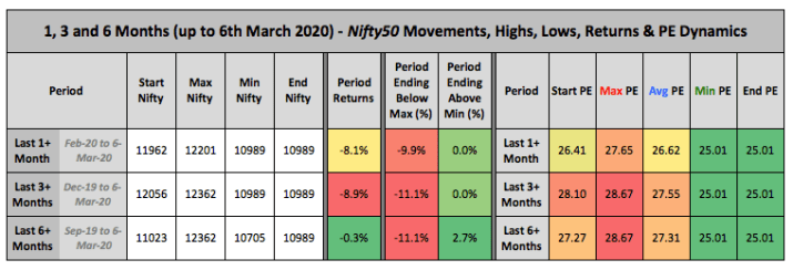
Now from the month-wise depiction, let’s have a look at more aggregate time periods in the last few months. Let’s analyse the above-highlighted data points when period under consideration in aggregated to 3-months and 6 months (plus a 1-previous month for more comparative analysis):
Now with PE of Nifty50 analysed in various cuts, let’s move ahead to the analysis of P/BV and Dividend Yields of the Nifty50
Historical P/BV Ratios – Nifty 50

P/BV Ratio of Nifty (on the 6th March 2020): 3.09
Historical Dividend Yield – Nifty 50

Dividend Yield of Nifty (on the 6th March 2020): 1.39%
That was all about Nifty50 – the more popular bellwether index of India. But as you know, there are several other Indexes in India.
So now let’s do a historical analysis of the larger space, i.e. top 500 companies of the stock markets. And these are best represented by the Nifty 500 index.
As the name suggests, Nifty500 is made up of top 500 companies which represent about 96.1% of the free-float market capitalization of the stocks listed on NSE (March 2019). Nifty50, on the other hand, is an index of 50 of the largest and most frequently traded stocks on NSE. These represent about 66.8% of the free-float market capitalization of the NSE listed stocks (March 2019).
So obviously, Nifty500 is a much broader index than Nifty50 and provides a better representation of the overall markets.
So let’s see…
Historical P/E Ratios – Nifty 500

P/E Ratio of Nifty50 (on 6th March 2020): 28.55
Historical P/BV Ratios – Nifty 500

P/BV Ratio of Nifty50 (on 6th March 2020): 2.96
Historical Dividend Yield – Nifty 500

Dividend Yield of Nifty50 (on 6th March 2020): 1.32%
The State of Indian Markets section has also been updated with new Nifty heat maps (link).
And why should we be tracking these ratios? Because there are clear indications that market valuations have some relation to how much your expected returns are. Does it mean that these models have predictive power and can help you time the markets? I don’t know. I just present the data and what I see in it. But if it interests you (and I am sure you would want to know it), then do check the Detailed analysis of how much return you can expect depending on when the actual investments have been made (at various P/E, P/BV and Dividend Yield levels). You can read this super detailed analysis at Nifty P/E Ratio Vs Returns Analysis (Updated). I am sure you would like the insights.
Hi Dev,
Still, we are in the Excuse(A Not good PE) Value. Need the market to correct it down 🙂